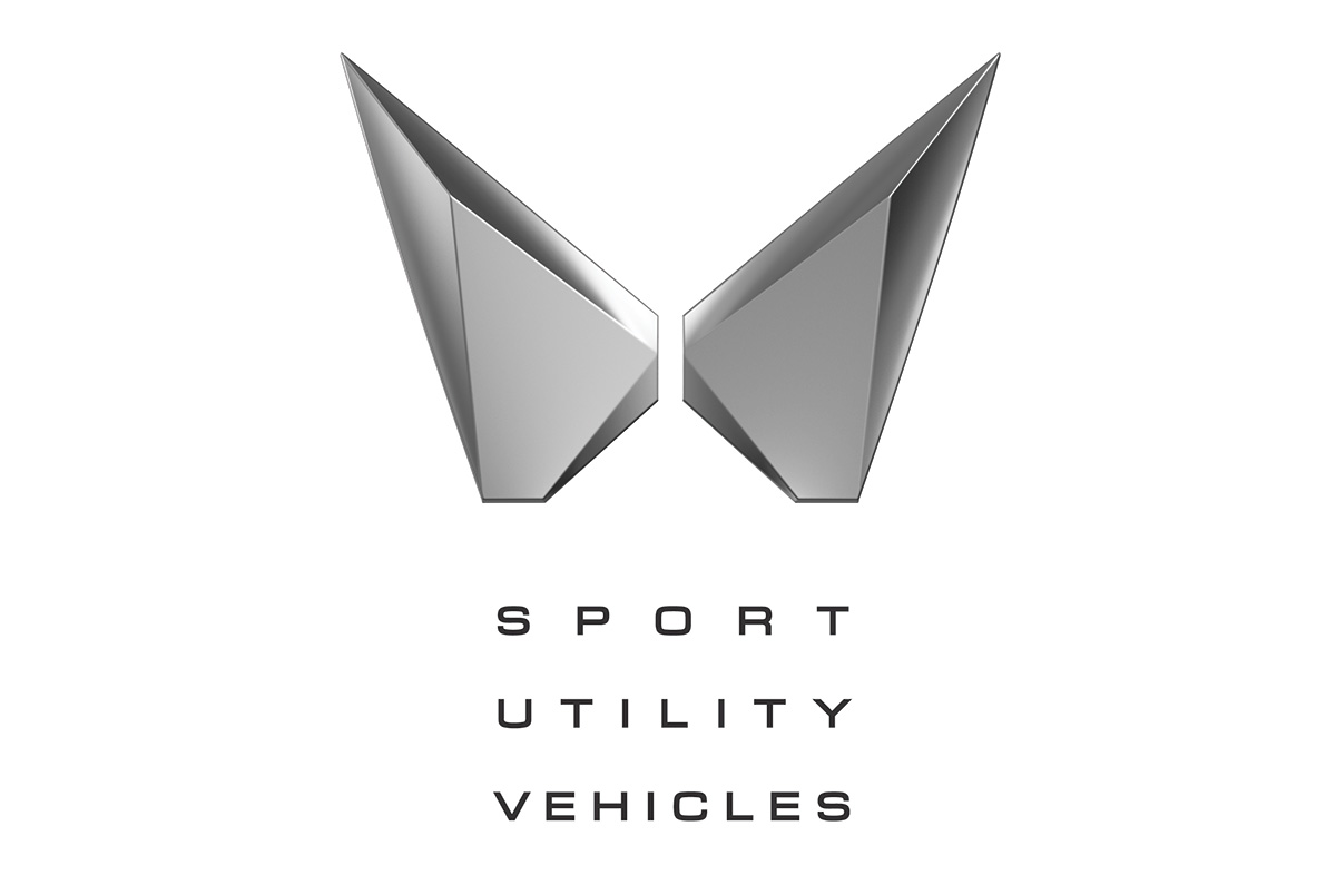

Mahindra launched its new logo 'Twin peaks logo' in the shape of an capital "M', its one of the first design projects by pratap bose after Joining Mahindra and Mahindra.
For me it looks like a lot of things, like an infinity sign or more worse it looks like a butteryfly. Nothing wrong with butterfly but its simply too feminine with respect to the vehicles that Mahindra stands for.. I would have liked to see something more masculine and rugged instead of a infinity sign or a butterfly.
a simpler form of the logo is availbale to order from our website https://mayastickers.com/mahindra-new-2021-logo-stickers


Leave a Comment